
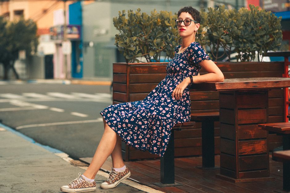
Mixing prints can make familiar clothes feel more interesting without adding anything new to your wardrobe. The trick is to give the patterns a connection, then leave enough space for each one to be seen. You do not need perfectly matching colours or a collection of statement pieces. A striped top, a patterned skirt and a little patience in front of the mirror are enough to start.
This guide to Mixing Prints Without Clashing focuses on how patterns work together: their size, spacing, colours and position within an outfit. Use these checks to build combinations that feel deliberate and comfortable, whether you prefer a quiet detail or a more noticeable mix.
Start with two prints you already enjoy wearing
Choose one printed garment as your starting point. It might be a dress you wear regularly or trousers whose colours make you feel good. Keep that piece on while you try possible partners. This gives you a clear reference and stops the exercise becoming a pile of unrelated clothes on the bed.
For your first attempt, limit the outfit to two visible prints. That includes patterns on shoes, bags and scarves. There is nothing wrong with adding more later, but two let you see which decisions are helping. Choose familiar cuts so that an unfamiliar silhouette does not distract you from judging the patterns.
Look for a colour connection
A shared colour is a useful starting point because it gives different patterns something in common. Lay the garments beside each other and look beyond the most obvious shade. A small cream petal in a floral skirt might connect with the cream background of a striped shirt, even if their main colours are different.
The shades need not be identical. Look for colours that seem comfortable together in daylight. If one cream looks distinctly yellow beside a very cool white, try another partner before deciding the prints themselves are the problem.
Notice the background as well as the motif
The background often occupies more space than the printed shapes. Two garments with dark backgrounds can feel connected even when one has dots and the other has leaves. Alternatively, a pale background on one piece can provide relief beside a densely patterned darker piece.
If the colours feel scattered, choose one shade already present for your plain layers. A navy jumper over a patterned skirt can echo navy lines in a printed collar. You are repeating a useful thread through the outfit, rather than trying to match every colour.
Vary the scale so the prints have different jobs
Two patterns of a similar size can compete, especially when both have crisp outlines and strong contrast. Try pairing a larger, open design with something smaller and more regular. Broad abstract shapes beside fine stripes, for example, are easier to distinguish than two equally busy, medium-sized designs.
Scale is about what you see while wearing the clothes, not simply the size of a single flower or square. A large motif repeated tightly across a garment can look busier than a smaller motif with plenty of empty background around it.
Check from a few steps away
Stand back from the mirror. A tiny dot or narrow stripe may read almost as a texture at that distance, allowing the other print to take the lead. If both garments seem to flicker or merge into one restless area, change one pattern’s scale or reduce how much of it shows.
This is a guide, not a rule that bans similar-sized prints. If you enjoy a lively combination, keep it. The useful question is whether you can see the separate pieces clearly and whether the overall effect suits your taste.
Balance contrast and spacing
A black-and-white geometric design attracts attention differently from a softly drawn print in related shades. When one pattern has a sharp difference between its lightest and darkest colours, try a gentler partner. This gives your eye somewhere quieter to rest without requiring an entirely plain outfit.
Spacing helps too. An airy design with visible background can sit comfortably beside a close-set repeat. If both prints are dense, expose a little plain fabric between them, such as a vest beneath an open shirt. Even a narrow break can make the arrangement easier to read.
Control how much of each print you show
You do not have to give both patterns equal space. A printed blouse beneath a dress might reveal only its collar and cuffs. A patterned scarf can introduce a second design to a dress without covering much of it. These smaller areas let you test a combination before wearing two large printed pieces together.
Choose which garment you want to notice first, then adjust the other around it. Try opening a cardigan, folding a scarf more narrowly or leaving a shirt untucked. Check that these changes feel comfortable when you move; a combination that needs constant arranging will soon become irritating.
Try three useful starting combinations
These examples show different ways to create a connection. Use whatever comparable pieces you own, and treat each suggestion as a starting point rather than a shopping list.
- Fine stripes with an open botanical print: pair a cream-and-navy striped top with a leafy skirt containing a little navy. Let the larger leaves draw attention, and keep the shoes plain.
- Small dots with broad abstract shapes: try a dark dotted blouse beneath an open jacket with a larger abstract design. A shared dark background helps the pieces relate, while the different scales keep them distinct.
- A geometric scarf with a softly patterned dress: choose a scarf that repeats one colour from the dress. Fold it so only a modest area shows, then check whether its sharper lines add definition without crowding the neckline.
Keep the finishing pieces purposeful
Once the printed garments work together, add the shoes, bag and outer layer you actually need. Plain accessories are an easy choice because they do not introduce another competing repeat. Pick a colour from the outfit or a familiar neutral that sits comfortably beside it.
Texture still contributes to the overall effect. A glossy bag, chunky knit and heavily detailed shoes can all attract attention, even without a print. If the finished outfit feels crowded, simplify one of these elements before abandoning the pattern combination.
Troubleshoot one change at a time
When a mix feels awkward, identify what catches your eye first. Changing several things at once makes it harder to learn which adjustment helped. Work through a short sequence:
- Check the colours: is there a visible connection, or would a different plain layer bring the pieces together?
- Check the scale: would a smaller, larger or more widely spaced second pattern be easier to read?
- Check the amount: could you show less of the supporting print?
- Check the extras: remove a patterned accessory and look again.
Finish by sitting down, walking and looking at the outfit with your coat on. Prints move and overlap as you do. Keep the combinations you enjoy in a quick outfit photograph so you can repeat them easily. With a few reliable pairings, mixing prints becomes a useful way to get more wear from the clothes you already like.